Reinventing a Primitive Contract Proposal App and Turning Around Customer Satisfaction.

There has to be a better way to write and approve contract proposals than passing a piece of paper around the office. The legacy application wasn't cutting it, a new version needed to walk users through the process by having easy to use forms and dynamic routing through a sequence of approvals.

Company
Georgia Tech Research Institute
Product
eRouting
Tasks
Redesign outdated UI.
Add dynamic connected workflows.
Create internal standards.
Role
UI/UX Designer

Previous Launch Unsuccessful

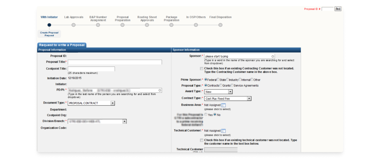
Before I arrived, Georgia Tech's Research Institute was off to a rough start with their existing internal document routing application. Government and research contracts, proposals, and security arrangements had started transitioning from paper forms passed between offices but the results were primitive, inconsistent, and slow to develop. The eRouting project aimed to give these apps a much needed makeover.

Before. Users were not pleased with the system as delivered.

The eRouting system required a fundamental transformation due to several key challenges:

  • No established design process or standards:
    The front-end was left virtually undesigned. There was no branding, no styling, no consistency. Workflows were clunky and the experience was not intuitive.
  • High levels of customer dissatisfaction:
    The application looked outdated and had the same feel as a paper form not a modern digital solution. Customers did not feel like they received a valuable purchase. The internal departments paying for these applications were hesitant to return and looking for third-party tools rather than custom made solutions we provided.
  • Unacceptably long application development times:
    Every delivery was far behind schedule. There was no front-end code reusability. Scaling and bug fixing were severely limited.

Bringing in a Design Process

These problems sourced from a lack of design planning and user research as there were no such processes in place on the development team.

I was brought on as the UI/UX designer to introduce these concepts and assist with expanding eRouting to a universal system with dozens of interconnected workflows.

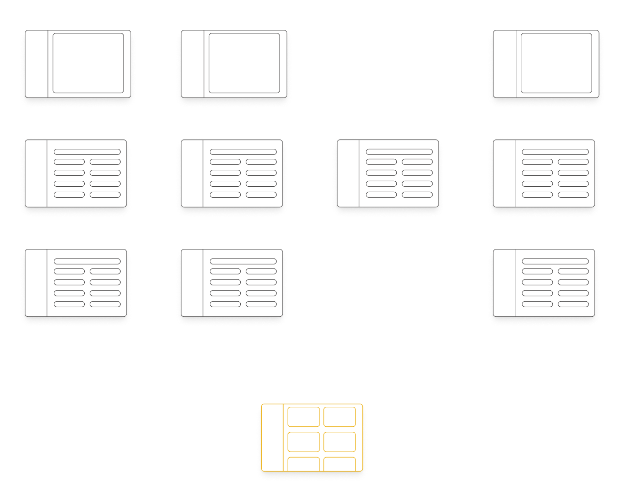
Flow diagram for each existing entry point and the new eRouting Home.

Who Are We Building This For?

The first step was to open up Customer-Developer communications. Rather than only department heads requesting specific solutions, I was able to meet with the actual day-to-day users of the routing process and discuss their current tasks and pain points. Beyond the cleanup, I was able to gather insights about additional problem areas such as attachments, comments, and linking related documents to each other. I kept these lines open throughout the process and would regularly check in as a part of each sprint demo.

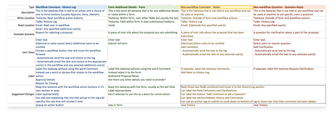
Research on distinguishing the four types of "comments" at different locations in a workflow.

Structure Has Arrived

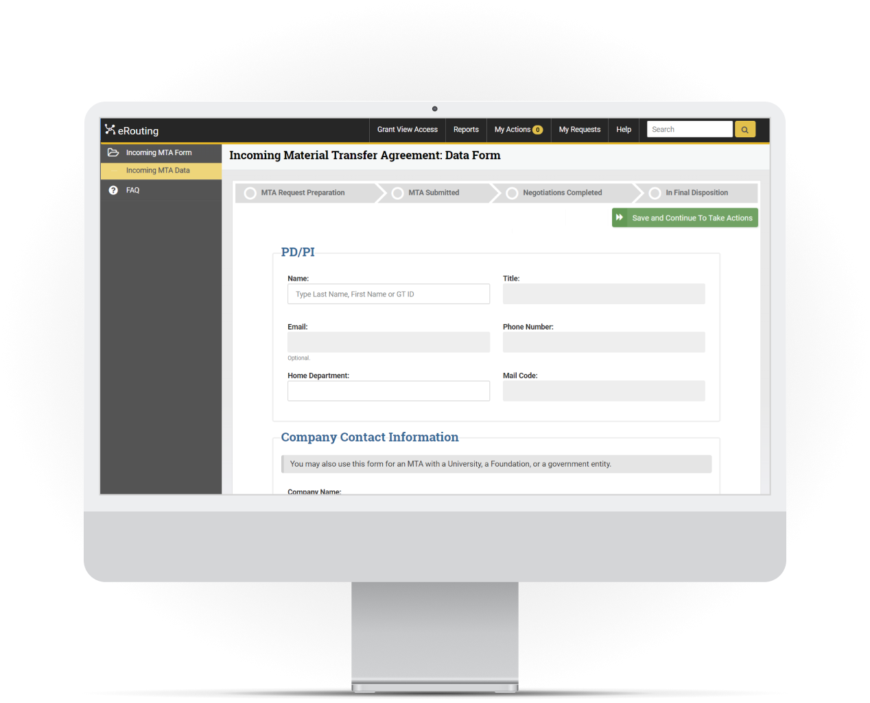
To begin to address the visual inconsistencies, I evaluated several UI frameworks and settled on Bootstrap even though it would need some modifications for our needs. This led to a new general structure that would be used in eRouting and in all other applications coming from our department:

  • Consistent Navigation and Status Awareness:
    Users needed to know how to start and what their current location was across eRouting. To facilitate this I added a suite-wide global menu, an app specific menu, and content headers to present this information in a uniform manner across document types.
  • Completion Guidance:
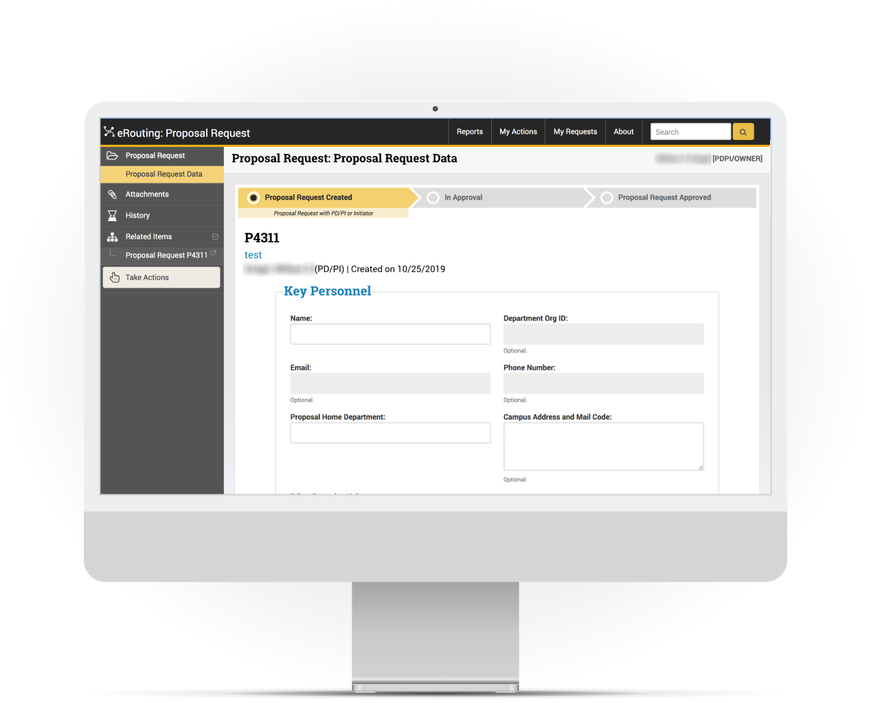
    Once in the correct workflow for a specific document type, users would want the task specific context how to proceed and knowledge where they have been and what the goal is, and if there are any pending blockers. The sidebar and progress bar gave information on how they could work through the document's subforms, attachments, and related items. The progress bar gave clarity on the document's lifecycle process and current status.
  • Responsive Design:
    Approvals needed to happen on the go or quickly during meetings so a mobile friendly design was needed.
  • Branding:
    Once the framework was in place I incorporated the Georgia Tech branding to bring the iconic gold into the styling. This gave the assure that this application was indeed developed specifically for them.

Introducing Components

Beyond those specific user needs there was still an internal audience needing changes to address speeding up the development time. Bootstrap offered powerful pre-built classes but every detail needed to be specified and required new expertise. All engineers need to be able to use these new features but it wasn't practical or efficient for them to expand their responsibilities in this direction at the time.

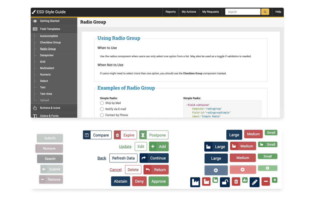
To solve this I took the initiative to transition the team to using templated web components, a practice that was not in place in the department. Previously every element was written in raw HTML by hand or copied and pasted, which was far from a sustainable practice. To facilitate the transition to these changes, I developed a design system with a component library, style guide, and usage documentation. Buttons, form fields, icons, and more complex features such as dynamic progress bars were created with examples showing status variants and notes about how they should be used.
Style guide, component library and examples, sample custom elements.

Make It Easier

Beyond the UI overhaul, I evaluated and implemented design principles to give eRouting users more comfort and familiarity at every opportunity across the application.

  • Workflow Patterns:
    Added a universal action center to approve, deny, and route all document types from the same logical place across all flows.
  • Error Prevention:
    Incorporated inline validation, hints, tooltips, and support links. Changed form fields to use selects and autocompletes where possible to reduce the chance for inappropriate data.
  • Increased User Control:
    Allowed users to save at any time and come back when ready, rather than only submitting a completed form.
    And included a "withdraw proposal" action to undo submissions that might need changes.
  • Engineer Assistance:
    Wrote in-page tutorials for engineers, documenting how to include new design components quickly and correctly into new forms.
Proposal history and next steps are always clear in this progress bar that supports dynamic routing changes.

A New Era

The overhaul of eRouting was a massive success and elevated the capabilities of the development team. Users were excited to use the application and take advantage of the increased speed and capabilities in their daily work. Plans were underway to extend eRouting to more document types. Engineers also felt empowered to use the design system. Feature delivery was magnitudes faster with a front-end code reduction of 95%. We were now able to deliver better looking and easier to use products faster.

That said, there was still room for improvement. More comprehensive user testing would make sure that development was focused on useful features. Solutions could be built with future scalability in mind rather than individual quick fixes. Communicating the trade-offs and benefits of different UI choices to stakeholders could have been done more clearly when all presented options do not have equal impacts.